Matthew Carter
b. 1937, London, England
a–z
suite of 26 aquatints with chine collé
14 x 14 inches (each sheet || image size variable)
edition 52
2016
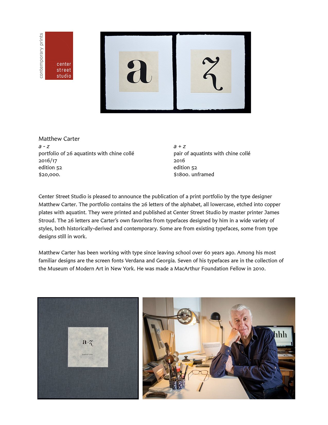
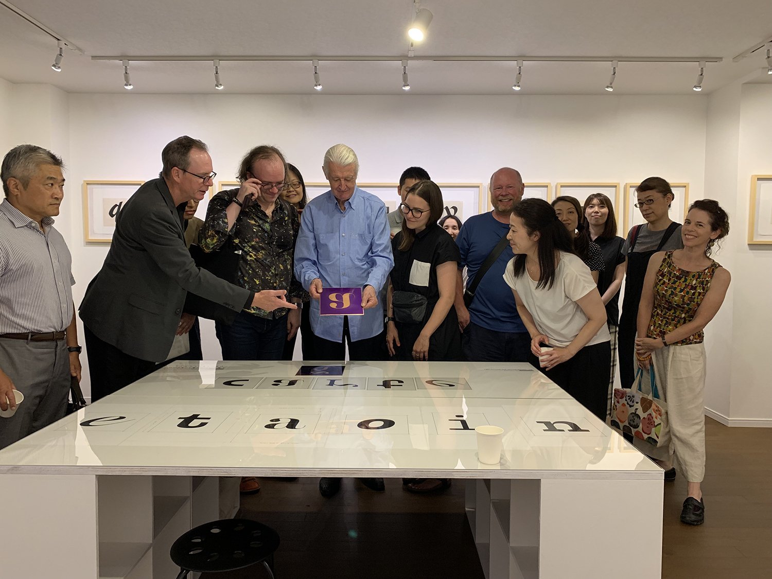
From a British ‘Modern’ type. The change in fashion from the ‘Old Style’ types of the great English originators, Caslon and Baskerville, to ‘Modern’ types inspired by the Continental innovators, Didot and Bodoni, began in about 1800 and transformed British typefounding within twenty years. The best of the British Moderns were made at the foundry of Edmund Fry who, although he thought of himself as a fashion victim and deplored the new “rude, pernicious, and most unclassical” style, made excellent types with a certain jauntiness that relieves the austerity of the Didot model. I prefer this bold weight of Modern to the full-blown style known as ‘Fat Face,’ that is associated with William Thorowgood, successor to the Fry foundry.
From Buster, an ultra-heavy slabserif typeface in the style known as Egyptian. These massive types date from the 18-teens and were designed to be more eye-catching in big sizes for advertisements than legible in text. Buster was never released commercially but was used to set a poster in honor of Roger Black, an old friend and esteemed publication designer, an aficionado of Egyptian types.
In the 1970s I designed a Greek typeface named Cadmus. This was a flop in Greece—it looked too archaic. Not to be discouraged I reused some of the letters in a Latin sanserif. Soon after Cherie Cone and I started our own company in 1991, Apple adopted the sanserif to demonstrate the ability of their new Quickdraw GX technology to store the extreme weights and widths of a type family and generate the intermediate styles on the fly. David Berlow and I produced the poles of weight and width. In the end GX did not get off the ground. I was left with the Regular weight of the sanserif, named Skia by Apple with whom I share the rights. The ‘c’ is from a bolder weight, designed the hard way.
The types of Giambattista Bodoni (1740–1813) of Parma were influenced successively by two French typefounders, Fournier and Didot. It is the later style of Didotesque neo-classical types with their strong contrast between thick and thin strokes that are nowadays associated with Bodoni’s name, but I prefer his earlier manner with its subtler modulation of stress. This letter is from a projected proto-Bodoni type.
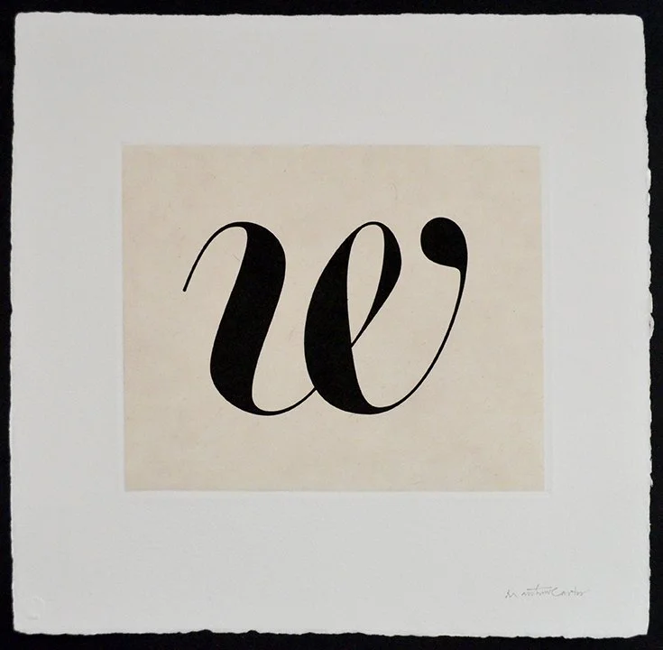
Snell Roundhand (1966) was derived from the work of Charles Snell (1667–1733), English writing master and accountant, whose handwriting manual, The Standard Rules of the Round and Round-Text Hands, gave geometrical diagrams for the formation of letters that must have been daunting to follow with a quill pen but made excellent sources for a typeface. Bold and Black weights of Snell were added later. This is from the Bold.
From the Bold weight of Yale, a typeface commissioned by John Gambell, Yale’s University Printer. The Yale type is in the Aldine style that originated in the architypical Roman type of De Aetna, cut by Francesco Griffo and printed by Aldus Manutius in 1495. The book has a modest format and a plain-looking page, but the type is remarkable for its readability and elegance. There is a copy of De Aetna in the Beinecke Library at Yale. To pore over it is both inspiring and humbling to any type designer.
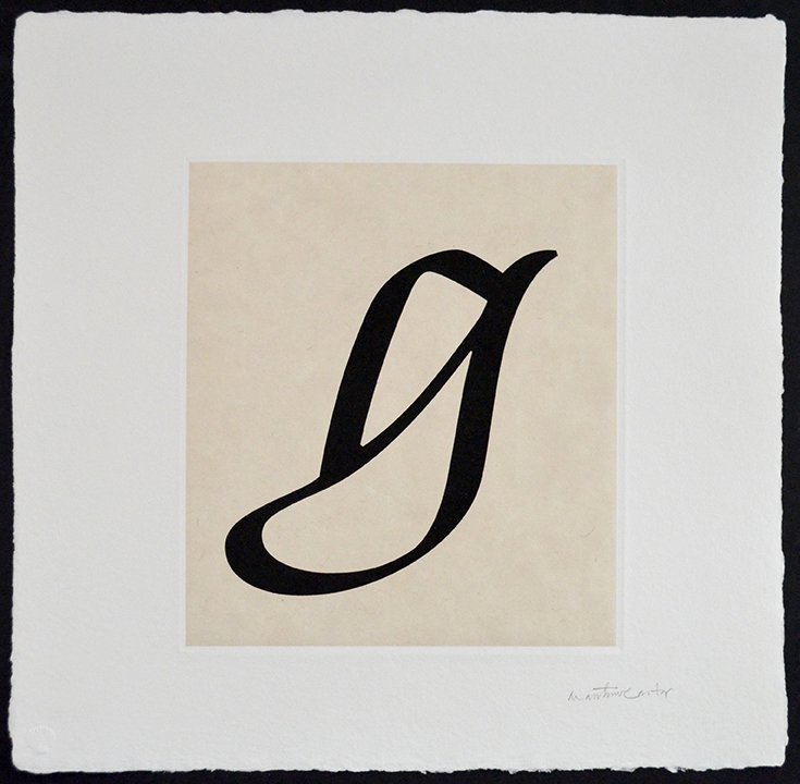
The Italic ‘g’ from Galliard (1978) a design inspired by the types of the Parisian punchcutter Robert Granjon (1513–1589). On visits to the Plantin-Moretus Museum in Antwerp in 1956 I was able to handle punches cut by Granjon, an unforgettable initiation. Granjon was the first, so far as we know, to give names to his types, among them “La Gaillard” for a small Roman. A galliard is a lively dance.
Wrigley was commissioned by Steve Hoffman for attention-grabbing headlines in his redesign of Sports Illustrated in 1998. What began as a modest family of Romans and Italics has since been expanded into an array of 60 styles in many weights and widths by Jesse Ragan for the Font Bureau. The new version is named Roster—this blocky ‘h’ is from the original Wrigley Italic, now happily absorbed into Roster.
I used to set the letters I wrote in one or other of my typefaces but I decided that this looked too typographic and official for personal correspondence. I therefore made myself a more appropriate typewriter-like font, loosely based on a Remington type. Typewriter faces had a fixed pitch, in other words all letters had to be on the same width. This made ‘m’ and ‘w’ too narrow and ‘i’ and ‘j’ too wide—hence the characteristically exaggerated horizontal strokes of this form. The tittle is oversized to prevent it from disappearing when struck through a typewriter ribbon.
From Sitka, a commission from Microsoft that was undertaken as a collaboration with Kevin Larson, an expert in the science of reading. At each stage of development the design was tested for its legibility and the findings used to improve the typeface. The narrowest lowercase letters, ‘i’, ‘j’ and ‘l’, were consistently problematic (by contrast, the ‘m’ always tested well). To mitigate the poor performance of the ‘j’ we made it as wide as possible. There is a limit to how far this can go short of caricature, but the generous curve of the descending stroke was our attempt to make it easier to read in text.
Bell Centennial (1978) was designed for the US telephone directories. It was my first experience of digital design at a primitive state of the technology that required me to draw every character on quadrille graph paper, pixel by pixel. The open crotches where strokes meet are to compensate for the effects of printing at high speed and tiny size on newsprint. This is from the Name and Number face.
After I had finished Bitstream Charter in 1987 I made an experimental Script from the Italic by designing cursive forms for the lowercase letters with ascending or descending strokes, and for the capitals. This was not an original idea; I thought I’d seen in the type specimen of Pierre-Simon Fournier of 1766 a Script and an Italic on the same body that shared some of the small lowercase letters. In the end Charter Script never got beyond the experimental stage, but I still like some of its cursive forms, this ‘l’ among them. Perhaps I should have persevered.
From Flamande (1996), a textura blackletter in the style of the 16th-century Flemish punchcutter Hendrik van den Keere. It is less stiff than the Rhineland blackletter adopted by Gutenberg. I did a similar type for headlines in The New York Times Magazine when Janet Froelich was its art director (it’s no longer used), and for the nameplate of the International New York Times. The textura style of blackletter is often referred to as fraktur in the US although that is stricktly speaking a misnomer.
This letter is a one-off. It is not part of any existing or soon-to-exist typeface, nor an orphan from an abandoned project. It’s the only letter of the 26 in this portfolio that I drew from scratch for no other reason than it has features that I like but are not otherwise represented here: prominent wedge-shaped serifs, and sturdy strokes with a delicate joint where the arch springs. It’s an unfamiliar experience for a type designer to draw a solitary letter—we think instinctively in multiples—but it makes a refreshing change.
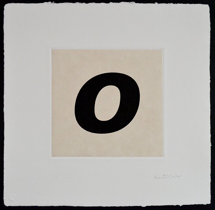
Verdana (1996) was commissioned by Microsoft as a ‘screen font,’ to be purpose-designed for maximum legibility on computer monitors. It replaced earlier adaptations of printer fonts that were not necessarily ideal for the new digital technology. This is from the Bold Italic. A sanserif ‘o’ whose form is very simple is paradoxically difficult to draw; the slightest error in a contour that might be disguised in a more complex form becomes glaringly obvious. The ‘c’ in this portfolio is another example of a letterform whose apparent simplicity is deceptive—as I know from the amount of work it took.
Letters with breaks in them, made originally for stenciling, have evolved into a typographical subspecies that is more decorative than functional. This ‘p’ is from a stencil type that has not yet progressed beyond trial characters. Joining serifs to stems by chamfers instead of curved brackets is an idea I first used in Charter (1987) as a means of reducing the digital data needed to define a contour. The technical reason is no longer relevant, but I like the no-nonsense look of the chamfers. To be resumed.
From Cascade, an informal pen script. It got its name because I was working on it in Brooklyn in the evening of 9 November 1965 when the lights went out. At first I thought it was just our building but then I saw from my window that Manhattan was dark. In fact most of the Northeast US and Ontario in Canada lost power in a famous blackout caused by progressive overloads of the grid described as “cascading.”
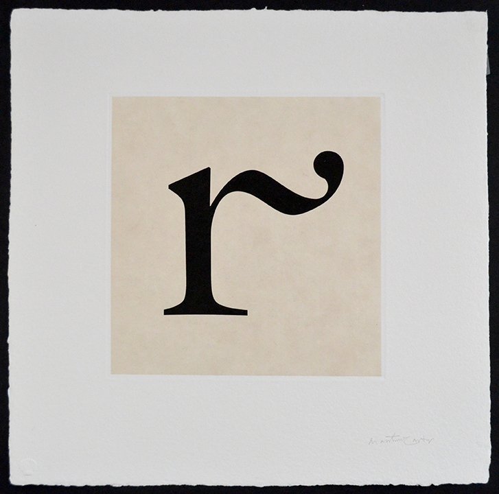
The incunabular type of Aldus’s De Aetna contained a handful of lowercase letters with strokes extending to the right, a jaunty holdover of the scribal habit of ending words with a flourish. In the great flowering of French typography in the 16th century, types cut by Claude Garamond and Robert Granjon had more exuberant flourishes. When I drew Galliard for photocomposition there was only room in the font for a few final letters with flourishes, but when I came to digitize ITC Galliard in 1992 I could not resist adding a few more, including this ‘r’ which waves to the reader from the end of words.
Carter Sans, released by Monotype in 2010, is a sanserif of an unusual kind; the vertical stems and horizontal strokes are not of uniform thickness through their length, they flare towards their extremities like trumpet bells. This characteristic is not at its most obvious in an ‘s’ that has no straight lines, but the modulation can be seen in the swelling of the terminals at top right and bottom left. In producing Carter Sans I was greatly assisted by a fellow designer, Dan Reynolds. The text of this booklet is set in Carter Sans.
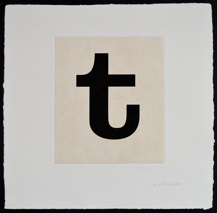
The 19th-century Ionic types and their cousins the Clarendons are essentially beefed up versions of Moderns (see the ‘a’ in this portfolio). Their sturdy physiques with strong serifs and generous x-heights made them very adaptable, providing models for a slew of hardworking American newspaper text types that could stand up to stereotyping and rotary presswork. They were also the ancestors of typewriter faces.
The enduring reputation of the typefoundry begun by William Caslon in London in 1720s is based on his superbly legible text types, but the foundry also cast large sizes that are less well known today. Big Caslon (1994) pays homage to these display faces, pleasantly vigorous and eccentric as they are. In common with some of my other designs Big Caslon has benefitted from skillful expansion into a larger family by the Font Bureau.
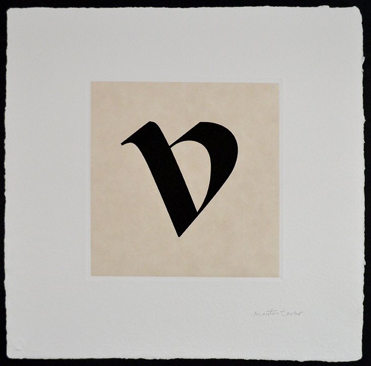
Rotunda, the southern form of blackletter native to Italy and Spain, is very different from the northern textura. Its more ample letterforms gracefully avoid the picket-fence effect of insistent verticals in textura. I designed a rotunda lowercase, nicknamed Redondo, but the Gothic capitals have stumped me. The type-designers Rudolf Koch and E. R. Weiss, the great experts in Gothic, gave their rotunda types capitals that are more Roman than Gothic. I should bow to their superior knowledge and try the same idea. Meanwhile, here is the ‘v.’
I must have inherited my fondness for Fry’s Canon type from my father, Harry Carter, who was responsible for having it cast for the Kynoch Press in 1930. The same font is now owned by the fine letterpress printer Ian Mortimer in London who kindly set a proof of it as the source of my digitization. The ‘a’ in this portfolio is from the companion Roman.
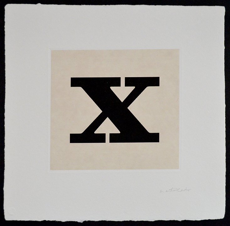
This ‘x,’ a relative of the ‘t,’ is a trial character for a bolder version of Ionic. The geometry looks odd at first sight: as the thicker of the two oblique strokes becomes heavier it forces the thinner stroke into a discontinuity, so the letter is no longer a simple cross of two elements but a structure with three pieces. It is a virtue of Ionics and Clarendons that they are forgiving of this kind of distortion. They make good bold and ultra-bold weights. Ionic Bold is in gestation as yet but will join the family in due course.
I’m no calligrapher but I’ve always been interested in the hands of Renaissance scribes and their influence on the earliest Roman types. In my opinion—not everybody would agree—the formality of classical inscriptional capitals transformed Roman type from scribes’ letters into printers’ letters rather quickly. Alisal (1998) takes the opposite tack: both capitals and lowercase are calligraphic. The trace of a broad-nibbed pen is plain to see in the structure of this letter.
Inspired by a Pica (about 12-point) italic from the late-1550s attributable to the French punchcutter Pierre Haultin (c.1510–1587). Haultin was a prolific typefounder and printer. He was also a Calvinist and of necessity peripatetic at a time of religious civil wars; he worked at various times in Paris, Lyons and Geneva before settling in 1571 in La Rochelle. His main contribution to typographic history is a series of unprecedentedly small types, ideal for setting the pocket-sized books that were so important to the spread of Calvinism. Haultin’s beautiful Pica italic survives as matrices at the Plantin-Moretus Museum in Antwerp where they have been since 1561.
Selected Collections
Achenbach Foundation for Graphic Arts, Legion of Honor, San Francisco Art Museums, CA
Boston Museum of Fine Arts, Boston, MA
Fidelity Investments, Boston, MA
Getty Research Institute, Los Angeles, CA
Robert B. Haas Family Arts Library, Yale University, New Haven, CT
Houghton Library, Harvard University, Cambridge, MA
Morisawa, Inc, Tokyo, Japan
Musachino Art University, Museum and Library, Tokyo, Japan
Museum of Modern Art, New York, NY
Newberry Library, Chicago, IL
Wellington Management Corp, Boston, MA
